|
|
Post by advent on Jan 18, 2006 21:56:42 GMT -5
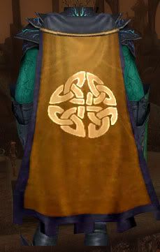
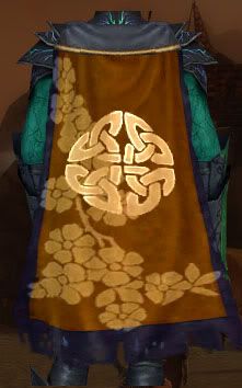
Alright, so with the consideration of our a new guild hall, i've also been discussing an alteration on the cape with various members as well. Thus, I asked Triaa if I could make a poll to see what everyone wants. The alteration would only take place on the outer rim, the main part of the cape would still be the same. I compiled a few screenshots of what I thought would be good alterations to the rim of the cape, but feel free to submit your own if you like another. 1.  2.  3.  4.  |
|
|
|
Post by Malae on Jan 30, 2006 3:36:38 GMT -5
When does this poll end?
|
|
|
|
Post by Delor on Apr 24, 2006 8:46:31 GMT -5
if this poll is still open, i think that maybe changing the gray border would be nice. Its always just stuck out to me and I don't care for it. Maybe a cape upgrade for factions would be in order?
|
|
|
|
Post by Triia on Apr 24, 2006 9:23:57 GMT -5
I'd like to see the border darker as well, but I'm not sure we can do it. I think the border color is linked to the intensity of the cape's color so we'd end up with a extremely dark orange cape to get a black border. I haven't messed around with it in a while. I'll have to check on that.
|
|
|
|
Post by Jupiter on Apr 24, 2006 11:49:36 GMT -5
You know silver or gold trim would be nice!  |
|
|
|
Post by Logo on Apr 24, 2006 14:47:41 GMT -5
I think Triia's right that the border of the cape is tied to the intensity of the cape color. I did come up with this compromise though - basically a reversal of the gradient. I'm not sure how I feel about it myself, but I'm just throwing it out there, as the border looks quite good:  Also, I was wondering if we could put custom designs on certain members' capes. This one, for example, is just crying out for Malae:
THE FOLLOWING IMAGE IS JUST A JOKE. THE TATTERED BORDER IS AN EVIL THING AND MALAE IS A VERY MANLY MAN WHO JUST HAPPENS TO LIKE THE COLOR PURPLE. |
|
|
|
Post by Triia on Apr 24, 2006 15:20:53 GMT -5
My god, Logo! What's happened to your head?!?  I have to agree with Jupiter... the best option would have to be a gold border. And for the record, I really dislike the tattered look on the bottom. It's just not becoming of the Republic. |
|
|
|
Post by Logo on Apr 24, 2006 15:29:00 GMT -5
My god, Logo! What's happened to your head?!?  I have to agree with Jupiter... the best option would have to be a gold border. And for the record, I really dislike the tattered look on the bottom. It's just not becoming of the Republic. I've lost my head! Ahahahahaahaha! The tattered look would only be for Malae, don't worry. And finally, yes, gold would be awesome, but it's just not an option right now. |
|
|
|
Post by Malae on Apr 24, 2006 17:23:10 GMT -5
No tattered! *angry*
Flower pattern though.. fabulous!!!
|
|
|
|
Post by Jupiter on Apr 24, 2006 20:27:32 GMT -5
The tattered border is a perfectionist's nightmare. It's so...asymmetrical!
I would be forced to hide my cape at all times if we ever chose that. But since we seem to all agree, I guess I need not worry.
|
|
|
|
Post by Logo on Apr 24, 2006 22:41:12 GMT -5
Really guys... you were so blown away by the uglyness of the tatters that you missed the real point of my post! What do you think about my design?
|
|
|
|
Post by Triia on Apr 24, 2006 23:02:28 GMT -5
I like it.
|
|
|
|
Post by Delor on Apr 25, 2006 0:36:03 GMT -5
i like it, though i like the shape of #'s 3 & 4 above better. It's a minor change, and the cape is still recognizable as the republic w/o needing your imagination. i'd chip in for the change.
|
|
|
|
Post by Jupiter on Apr 25, 2006 6:27:27 GMT -5
Yes, I definitely like that reverse gradient background pattern (had it on the cape we designed for our previous guild). And any trim besides tattered is fine with me.
|
|
|
|
Post by Darkwind on Apr 26, 2006 1:52:51 GMT -5
The flowers sort of crowd the cape, but also make it less bland. I would be happy either way.
|
|
![[HLR]](http://i.imgur.com/MqV5HNf.jpg)

![[HLR]](http://i.imgur.com/MqV5HNf.jpg)
